A MODERN LOFT IN THE HEART OF OLD INDUSTRIAL SOHO
For the next instalment of our Homes Around the World series, we spoke to Tommy Zung, Principal of Studio Zung, a New York based, modern studio integrating architecture, design and the artistry of living. Like Buster + Punch, Studio Zung’s Tommy Zung, has transitioned from fashion and surfing to Architecture in Design; in the same way Massimo Buster Minale comes from an architecture and motorbikes background and now works with solid metal. Studio Zung recently completed a residential project in Manhattan’s Soho district, which featured Buster + Punch hardware.
Can you tell us a bit more about Maison Crosby ?
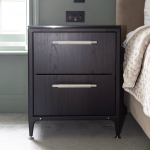
Maison Crosby is a 510 meter squared loft apartment, situated in an old industrial building within an old print factory, in Soho. The building has beautiful bones, with steel beams and a rich history, so it was important to respect that while renovating. We wanted to use pure materials, such as walnut, which goes well with Buster + Punch’s brass pull bars. All the cabinets for the kitchen and the Hemingway Bar were made locally in Brooklyn.
What was the brief for this project?
The brief was to maintain the existing character of the building and keep all the historical elements, while giving the apartment an update for a modern family. Maison Crosby is a very rare loft apartment for its size in Manhattan – it is almost unheard of to have such a large space to redesign, as one complete apartment.

Which space did you design first in Maison Crosby?
The main living area is uncharacteristically large and includes a ping pong table, a Hemingway style bar, the kitchen, a dining table with a leather banquet and sofas. The smaller more intimate pockets such as the bedrooms and the large laundry, branch off the main space.
Have you noticed any emerging trends for 2018 in East Coast interior design or architecture?
The East Coast and the rest of United States are finally starting to embrace more European trends. For a long time ‘Americana’ has been a popular design trend in the US as well as the industrial ‘Brooklyn’ look. This has never been Studio Zung’s outlook on design, we have always looked towards Paris, London, Copenhagen or Berlin for design inspiration. Our clients are becoming more and more familiar with design trends from these cities, making them more open to using these concepts in our projects for them.

Why did you choose the materials and textures you did for Maison Crosby?
I have spent much time travelling the world, surfing in places such as Tahiti, New Zealand, Africa, Morocco, which has encouraged me to navigate different cultures (from my own). This has taught me to be respectful of local cultures, the nature around them and their oceans, as well as learning what makes a difference to people and their homes. I think this experience has influenced the materials I use the most, steering me towards those which have longevity.
How has surfing influenced your outlook on design?
Surfing is a nomadic culture, it teaches you to tread lightly, spend well and let yourself be influenced by nature. For example, when designing the Crows Nest Hotel in Montauk we were directly inspired by the ocean, using weathered cedar wood.
Where do you look for interiors inspiration?
I am inspired by nature and in particular the ocean, the skies of Norway, the northern lights and steam rising off water. I always look to fashion for colour inspiration, for example, at magazine editorials, emerging trends or floral prints. For architectural inspiration, I always look at sculpture and never at other architecture projects.


