EXPLORE A STUDY IN LIGHT MODERNITY

Basked in an abundance of natural light, the white tones of Sofie Viktorsson’s Stockholm apartment mix with light natural materials, to enhance its original details. Pops of Buster + Punch steel hardware add a sophisticated contemporary edge.
We walked through the project and how Sofie struck the perfect chord between enhancing the existing original details and adding depth with new additions.

The apartment has a real sense of light. Is that something you wanted to work with in the interiors?
Yes, light and space are very important, especially in these Scandinavian apartments from the last century. In addition, I’ve aimed to keep the interiors clean and bright, emphasising natural light to create a sense of openness and tranquillity. In this way, the carefully chosen details get more focus and are not lost in the noise.

What feeling were you looking to set with the colours and materials in the apartment? Give us a walkthrough.
Tranquillity, airiness, space, sustainability and luxury. We wanted the flat to feel like a mix between Scandinavian light and Parisian white with a focus on natural and original materials and details but at the same time mixing up with modern details to create a contemporary feeling. Buster & Punch’s products are not only modern but also quite tough and raw which creates a great contrast to the classic original details of the flat. They complement each other well.


The apartment appears to have a lot of original details. How did you balance the new expressions with the original elements?
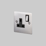
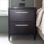
To not get stuck in an era and to create harmonious balance it is important to preserve original details and mix them up with modern features. That is why Buster + Punch details are the perfect products to add that extra to a traditional flat. To us what differs a good flat from an immaculate apartment lies in carefully chosen details that are applied throughout and picked up in every room to create coherence. That is why we chose Buster + Punch on all details such as kitchen hardware, electricity outlets and light switches.

How did you discover Buster + Punch, and which pieces and finishes have you used? How did they enhance the overall look?
We first looked for light switches that looked more continental, modern and discrete compared to traditional Swedish light switches. We Google searched and then, by chance, came across Buster + Punch, fell in love with the entire product catalogue, and decided to use it for all knobs, switches etc to create a calm coherence throughout the flat.

Finally, we’re committed to the idea that details are everything. What’s your take?
Of course, details are everything, but they need to be carefully chosen and balanced so they don’t disappear in the overall interior. But the details that are on display should be immaculate, just like Buster + Punch’s products.

The apartment is currently listed on Sotheby’s. Images by Anna Larsson.


