HERE’S TO HUE
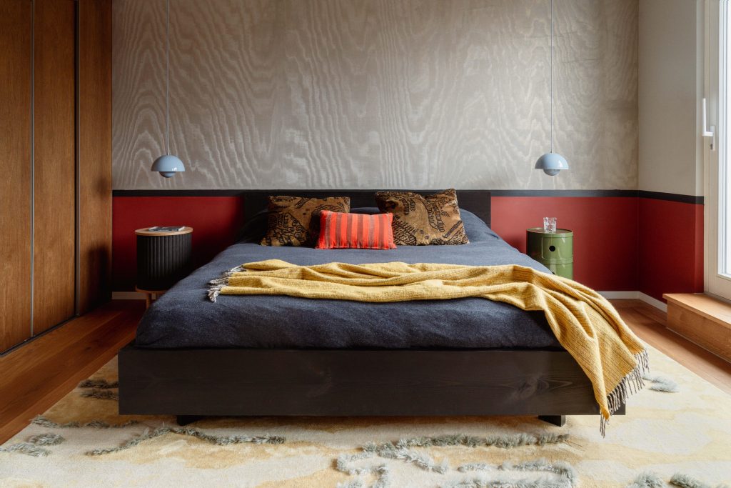
Studio Bosko is a female-led studio of four, working out of Berlin. Its founder, Kasia Kronberger, has a knack for attracting bold, ambitious clients who are fearless in getting experimental, often hailing from the cultural and creative industries. Its recent build, The Chroma Penthouse Project, exudes energy and vibrance from every aspect of its interior. Once we saw it, we knew a Q&A had to happen.
Introduce yourselves. Where are you based? How long have you been around? What would you say your style is?
Studio Bosko is a female-led team of four, a studio in Berlin that runs projects in Germany, Poland, and beyond. We’re a full-service interior design and architecture practice specialising in full-scope curation and bespoke solutions, including complex remodels and custom furnishings. It was founded by Kasia Kronberger, a leading tastemaker for clients with a strong appreciation for art and culture. Her projects are high-design yet always liveable. Each of our projects is different, yet the common thread in our aesthetic is the juxtaposition of styles and eras, creating emotive tensions in our clients’ spaces.
First up, the project looks fantastic. What was the brief from the clients?
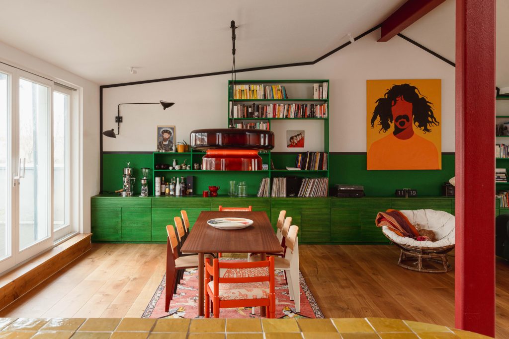
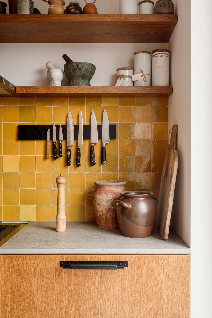
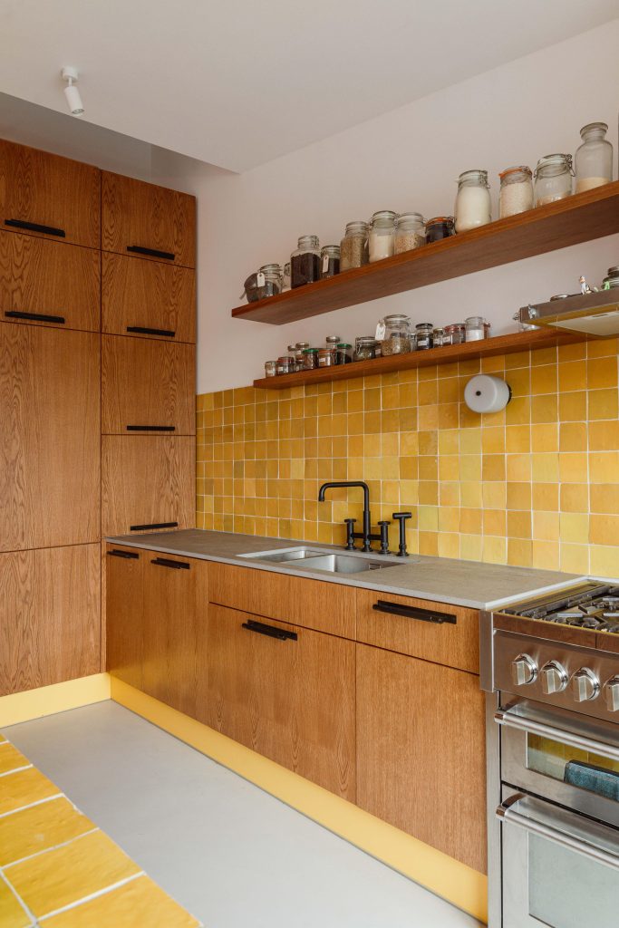
Thank you! The clients came with quite an open brief; however, there was a specific indication that they did not want to use any pastel colours. She is an illustrator specialising in comic books, so she had a strong preference for saturated, opaque colours. Her dream was to have a yellow backsplash in the kitchen. We pulled that a bit further.
You talk about ‘Liveable luxury’. Explain what this means to you and how it translates to your clients.
I studied sociology, which is a way of considering human needs. Our ultimate luxury is to drive our decisions by how something makes us feel and how it contributes to our desire for self-actualisation. That can be your emotional well-being, inner balance, or a pure sense of joy. At work with clients, it becomes intuitive—we dig deep into what makes them tick and what they feel is amazing for them individually. At the same time, it’s never too precious for daily life. The materials we choose are natural and durable; they’re there to serve for years, even if, with time, they develop. The pretty never trumps the functional. We don’t use decoration just for decoration’s sake. It has to have meaning for our clients.
The colour palette is incredible. How did you work towards the tones, and was the client involved in this as well?
The clients were involved in the sense that their brief included a strong disapproval of pastel tones. Our group chat during the project was even called ‘no pastels’. And she had this idea of a yellow kitchen backsplash that grew much further than just a strip on a wall. That was the starting point, which, through a definition of a primary palette, evolved into a more layered and nuanced composition.
We read that the project began as an empty shell. Were there any defining features of the space that led you to where it is now?
No, really, that’s what it was. An outer shell with load-bearing walls and windows. The volume was defined, but there was no floor, no electricity—nothing. We started with the basics.
Turning to details now, how did you come to use Buster + Punch? Did you know of our label previously?
Yes, I’ve used Buster + Punch in my previous kitchen before. I love hardware with solid materiality and tactile qualities. The clients were convinced quickly, as they wanted to make a nod to their previous home, which had a rather industrial aesthetic.
Which Buster + Punch pieces did you use, and why?
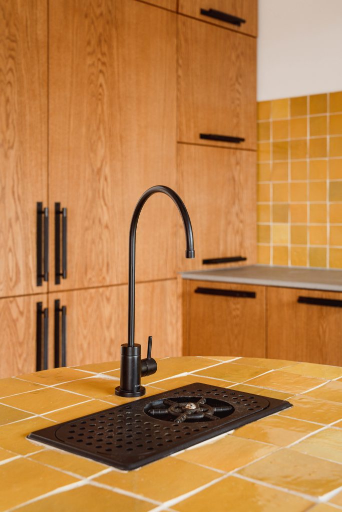
We used Buster + Punch pull bar handles in the kitchen and door hardware across the board. I chose black to balance out the sweetness of yellow zellige tiles and the yellow staining on the cabinetry. It grounded the space and gave the kitchen a bit of a workroom edge.
As a final question, what advice would you give to someone who wanted to bring colour into their home?
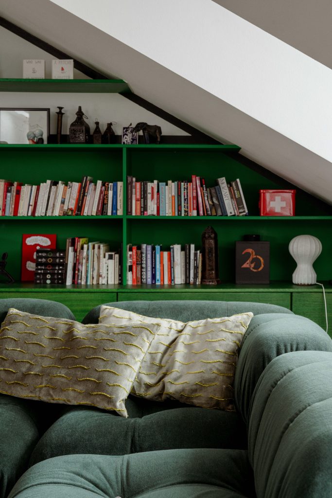
Simply to go for it! Not to fear colour. Don’t start with the sofa pillows, because you’re never going to get anywhere further than that. Pillows will not change how you feel about a room. Find a piece you’re in love with, even if it feels a bit daunting to integrate. Or, if it’s a renovation, start with the smallest space – which, for our clients, is often a powder room. I’m all for taking measured risks and stepping outside of the comfort zone.
project / @studio.bosko
photographer / @giuliamaretti_studio
