A dwelling full of calm and charm
The home of Rocky Barnes

Rocky Barnes and her husband, Matthew Cooper have created a serene family home in Los Angeles, where muted tones, matt plasterwork and eclectic pieces of furniture and accessories blend harmoniously.
We grabbed a few minutes with the multifaced content creator to talk through the styling, inspiration and how the pair have used Buster + Punch detailing to bring it all together.


Your home is definitely a before/after masterclass. Talk us through some of the biggest transformations you’ve made and the design considerations behind them.
One of the biggest transformations we made was plastering the entire house vs painting it. Every single surface in our house is plaster, which is such a unique thing. We also raised the interior roof line of our home and in turn, raised and expanded all the door and window heights to bring more light into the house.


In a recent post, you mentioned that having a ‘pro’ feel for the kitchen was a high priority. How have you brought that through?
My husband Matt is a chef and we have two little boys who love to eat so having chef-quality appliances and an elevated kitchen was super important. One of the elements we tried to keep consistent throughout the kitchen and the rest of our house is we tried to use all matte materials. Having all matte materials really elevates the space and makes everything have a consistent feel to it. Our plaster walls are matte, our wood cabinets are matte, and our hardware is matte. We used Buster and Punch matte handles and pulls in our kitchen which really tied the theme together.


The kitchen’s not the only space you’ve brought in Buster + Punch, which other pieces have you selected?
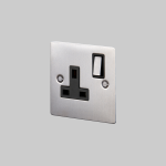
We gravitated towards the look and feel of the light dimmers. We had never seen anyone with those types of products before and really loved them. It was fun to be able to showcase a unique design in what is usually a really standard type of product. It felt really one of a kind to showcase a unique design element which elevated the room.

Was it easy to settle on the overall vibe of the home? And did you have a specific theme, functionality or ideas you wanted to express?
When we were originally talking about the vibe of our home it was summer. We wanted our house to feel
like an oasis and have a zen-like quality to it. I am very maximalist when it comes to design and my husband Matt is very minimalist, so we came together to create a neutral base layer with pops of colour in the furniture and accents which was a good in between for us.

[PHOTOGRAPHY. MATT COOPER.]


